
I Did a Full Data Analysis in 30 Minutes Without Opening a Single Tool
Thirty years in data. Principal Technical Data Analyst. I should be the last person impressed by a new analytics tool.

Instead, I’m sitting here staring at an interactive dashboard, a data profile, an EDA report, and a full analysis document—all generated in half an hour from a single CSV and a conversation.
Dashboard. Data profiling. Exploratory analysis. Visualizations. Executive summary. Full analysis report. Thirty minutes. One conversation. No Python. No Jupyter notebook. No BI tool. No terminal.
Just Claude Cowork with its Data plugin.
It also shipped a wrong number on the dashboard. And produced an executive summary that could have led leadership to make decisions based on a misunderstanding.
Both problems were catchable—if you know what to look for. That’s the entire point of this article.

What Claude Cowork Actually Is
I’ve been writing about Claude Code for months, arguing that Anthropic should rename it because the word “Code” scares away the people who need it most. Turns out, Anthropic was already working on the answer: Cowork.
Cowork lives in the Claude desktop app on macOS. No terminal. No command line. You open it, point it at your files, and describe what you want done. Claude breaks the task into steps, executes them, and loops you in before taking significant actions.
Think of it as Claude Code’s functionality without the developer packaging. Same agentic architecture, same ability to work with local files, same multi-step execution. But wrapped in an interface that doesn’t require you to know what cd means.
Anthropic recently launched plugins for Cowork, open-sourcing 11 of them on GitHub. The one that caught my attention immediately: the Data plugin.
The Data Plugin: Built for What We Actually Do
The Data plugin turns Cowork into a data analyst collaborator. It comes with slash commands that map directly to the workflow every analyst runs daily:
/data:build-dashboard— Creates interactive HTML dashboards with filters and charts/data:explore-data— Profiles a dataset’s shape, quality, and patterns/data:analyze— Runs ad-hoc analysis, EDA, statistical tests/data:write-query— Generates optimized SQL across dialects/data:create-viz— Builds Python visualizations/data:validate— QA checks before sharing with stakeholders
You can connect it to a data warehouse (Snowflake, Databricks, BigQuery) or just point it at a CSV. I used a CSV because that’s the reality for most analysts doing exploratory work.
I grabbed a common SaaS sales dataset (9,994 records, 19 columns, orders from 2020–2023 across multiple regions, industries, and products) and ran the full gauntlet.
Here’s exactly what happened—including the parts where the output needed an analyst’s eye.
The Dashboard: Minutes Instead of Half a Day
My prompt: /data:build-dashboard pointed at my SaaS-Sales.csv file.
Claude examined the data, identified the structure (regions, products, segments, time series), and asked what I wanted to focus on. I chose Executive Overview with time period, region, and product filters.
Within minutes, I had an interactive HTML dashboard with:
4 KPI cards (total revenue, profit, orders, units)
Revenue and profit trend line chart (monthly, 2020–2023)
Revenue by region doughnut chart
Top products horizontal bar chart
Revenue by segment comparison
Top 15 customers table, sortable by any column
Working dropdown filters that update everything instantly
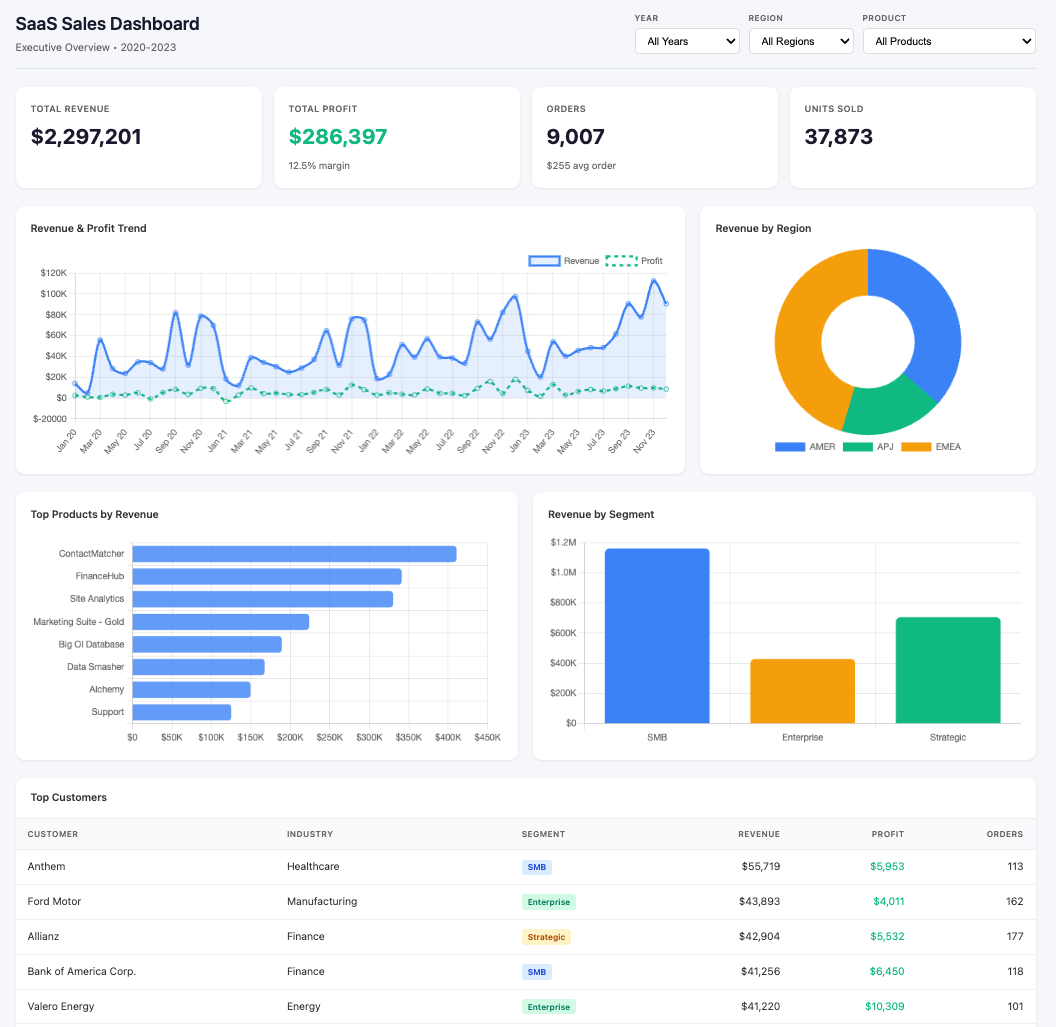
This is the kind of deliverable that normally takes me half a day in a BI tool. Not because building a dashboard is hard, but because of all the setup: connecting data, defining metrics, formatting charts, getting filters to work, making it presentable. Cowork collapsed all of that into a conversation.
The dashboard looked great. Professional. Stakeholder-ready.
It also had a wrong number. I didn’t know that yet.
Data Profiling: The Step Most Analysts Skip
My prompt: /data:explore-data
This is where the Data plugin started earning its keep. Claude generated a data profile covering:
Full column inventory with distinct values, top values, and notes
Statistical summaries for every metric (min, max, mean, median)
Data quality flags with specific issues and severity levels
Key business findings surfaced automatically
The quality flags caught real issues. It flagged that 18.7% of line items had negative profit (1,871 records totaling -$156K in losses), driven by excessive discounting. It spotted an extreme sales skew—the top 10% of line items account for 60% of revenue. It even noticed a Thursday anomaly: only 371 orders on Thursdays versus 1,871 on Tuesdays.
It also confirmed what was clean: no nulls, no duplicates, no encoding issues, consistent hierarchies, unique license IDs.
This is the kind of profiling that separates competent analysis from dangerous analysis. Skip this step and you build dashboards on assumptions. The Data plugin doesn’t skip it.
Exploratory Data Analysis: Real Findings, Not Summaries
My prompt: /data:analyze Perform an EDA
Claude went deep. Not just summaries—actual statistical analysis with visualizations.
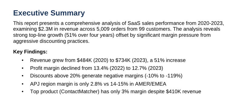
Revenue is growing, but margin is slipping. Revenue grew 51% from 2020 to 2023, but margin peaked at 13.4% in 2022 and dropped to 12.7% in 2023. Growth is masking a profitability problem.
Discounts are destroying the business. Transactions with no discount achieve 29.5% margins. Discounts of 1–20% still generate positive margins (11.9%). Anything above 20% goes negative. And 8.6% of transactions have 60–80% discounts, losing $1.22 for every $1 of revenue.
The kicker: the correlation between discount and sales volume is -0.03. Discounts aren’t even driving more sales. They’re just hemorrhaging margin for nothing.
APJ is bleeding money. AMER and EMEA both run 14–15% margins. APJ runs 2.8%. The problem is concentrated in Japan (-15.1% margin) and ANZ (-13.5% margin), both with 37% average discount rates. Meanwhile, India and APAC run 28–34% margins with minimal discounting. Same region, completely different pricing discipline.
The top product has a margin crisis. ContactMatcher is the #1 product by revenue ($410K) but achieves only 3% margin with $71K in losses from heavy discounting. Marketing Suite is actively losing money at -3% margin.
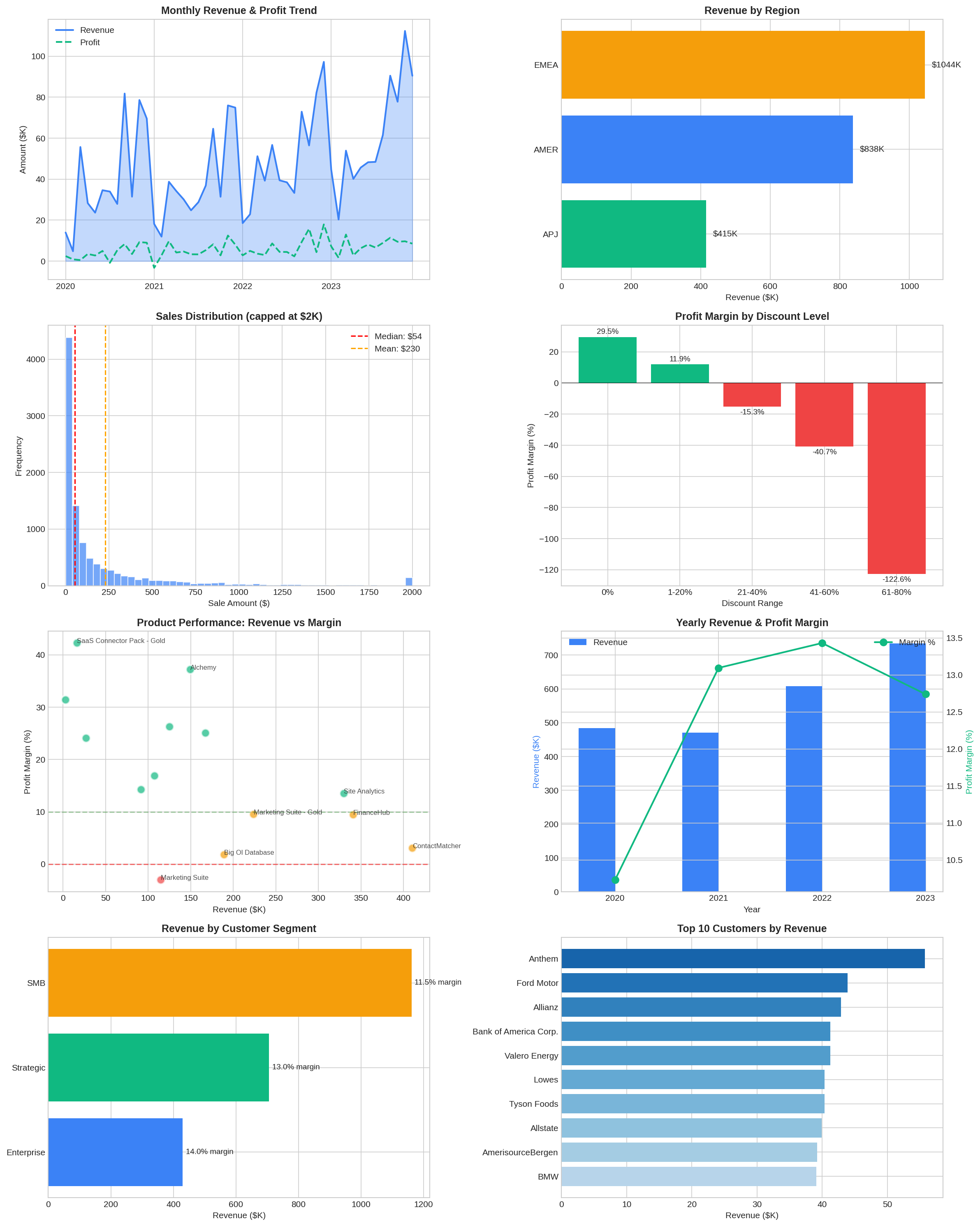
None of these findings are things I couldn’t have discovered manually. But manually, this analysis takes hours of query writing, chart building, and pattern recognition. The Data plugin did it in minutes and presented the findings in a structured format ready for stakeholder conversations.
I was impressed. Maybe too impressed. Because I almost moved on to the next step without checking the numbers against what I’d already seen.
Problem #1: The Wrong Number
After the EDA, I asked Claude to show me orders by year. Simple request. It returned a table: 5,009 unique orders across 2020–2023.
Something nagged at me. I went back to the dashboard.
The dashboard showed 9,007 total orders.
5,009 versus 9,007. That’s not a rounding difference. That’s nearly double.
I asked Claude to explain the discrepancy. It identified the bug immediately: when building the dashboard, it had grouped data across multiple dimensions (year, region, product) and counted unique orders within each group. Then in the JavaScript, it summed those group-level counts.
The problem: a single order containing two products gets counted once in each product group. Sum those up and you’ve double-counted every multi-product order.
# Grouped by multiple dimensions...
raw_data = df.groupby(['YearMonth', 'Year', 'Region', 'Product', ...]).agg(
    orders=('Order ID', 'nunique'),  # counted unique per group
)

# Then in JavaScript, summed across all groups...
const totalOrders = data.reduce((sum, row) => sum + row.orders, 0);
# Order #123 with 2 products = counted twice
The correct number was 5,009 unique orders. The dashboard was reporting 9,007. The average order value was showing $255 instead of the correct $459.
I told Claude to fix it. It regenerated the dashboard with accurate numbers within minutes.
Multi-dimensional aggregation double-counting is one of the most common analytical mistakes in BI work. I’ve seen it in Tableau dashboards, Power BI reports, and custom SQL pipelines built by experienced analysts who should know better. It’s easy to make and hard to spot if you’re not specifically looking for it.
I caught it because I cross-reference KPIs. When a number looks inflated, you check the grain. That’s not AI skill. That’s analyst instinct built over 30 years.
But what happened next was actually more concerning.
Problem #2: Correct Numbers, Misleading Framing
With the dashboard fixed, I asked Claude to create an executive summary based on the EDA. It produced a polished Word document—clean formatting, professional layout, exactly the kind of thing you’d hand to a VP between meetings.
The Key Metrics table looked compelling:
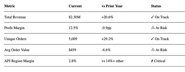
At first glance, this looks great. Clear, scannable, tells you where to focus. Exactly what executives want.
But look more carefully at the first two columns.
The “Current” column shows $2.30M in total revenue. That’s the aggregate across all four years of data (2020–2023). The “vs Prior Year” column shows +20.6%. That’s the year-over-year change comparing only 2023 to 2022.
A VP scanning this table is going to read “$2.30M revenue, growing 20.6%” and walk into their next meeting thinking the business did $2.3M last year with 20% growth. They didn’t. The business did $734K in 2023. The $2.3M is cumulative over four years.
Every number in the table is technically correct. The total revenue is $2.3M. The year-over-year growth is 20.6%. But putting them side by side in a “Current vs. Prior Year” framing creates a false relationship between numbers operating on completely different timeframes.
This is the kind of issue that doesn’t blow up immediately. It shapes decisions quietly. An executive uses that $2.3M figure in a planning discussion. It gets baked into a forecast. Nobody traces it back to a misleading table until the projections don’t land.
This problem is more dangerous than the outright bug. A wrong number—like the 9,007 order count—eventually gets caught because it won’t reconcile with other data. But misleading framing survives every accuracy check because each individual number passes validation. The error isn’t in the data. It’s in the presentation. And it takes someone who has sat in those executive meetings, who knows how leaders actually consume metrics tables, to recognize that this framing will be misread.
I’d argue this table needs to be completely redone. Execs want year-over-year performance—show them 2023 results versus 2022. Clean timeframes. No mixing cumulative aggregates with annual comparisons. If you absolutely must show a multi-year aggregate, label it explicitly: “Total Revenue (2020–2023): $2.30M.” Over-explain the timeframes. The cost of someone misinterpreting a number in an exec summary is always higher than the cost of an extra footnote.
Claude produced a table that is accurate, well-formatted, and potentially misleading. Only an analyst who understands how execs actually read these documents would spot the problem.
Two Problems, One Lesson
The dashboard bug and the executive summary framing are two different types of failure. Together, they tell the complete story of why analysts matter more—not less—as AI tools get faster.
The dashboard bug says: verify the numbers. Check the math. Cross-reference KPIs. Make sure the grain is right. This is analytical hygiene—basic but essential.
The executive summary says: verify the story the numbers are telling. Check how data is framed. Consider how your audience will interpret adjacent information. Make sure the presentation doesn’t create implications the data doesn’t support. This is analytical judgment—harder, subtler, and impossible to automate.
AI tools will keep getting better at calculation. They’ll probably stop double-counting orders within a few model updates. But understanding how an exec will read a table? Anticipating which juxtaposition of numbers will create a false impression? Knowing that mixing timeframes in a summary table is a stakeholder communication landmine?
That’s the work. That’s what experience teaches you. And no slash command replaces it.
The tool is fast. The tool is capable. The tool is not accountable.
You are.
Your name goes on the report. You sit in the meeting when someone asks “where did this number come from?” You’re the one who has to explain why the order count was wrong or why the VP built a forecast on a misleading revenue figure.
The faster the tool produces results, the more critical your review becomes. Speed without verification is just a more efficient way to be wrong. Polished framing without analyst judgment is just a more convincing way to mislead.
The Full Report: A Solid First Draft
After flagging the executive summary for rework, I asked Claude to produce a full analysis report.
Claude generated a document with real substance: descriptive statistics with skewness, kurtosis, and percentile distributions. Time series analysis with CAGR and seasonality indices. Segmentation analysis with ANOVA tests. A discount impact analysis with t-tests and a statistically identified 20% break-even threshold. Prioritized recommendations with estimated impact. Companion visualizations.
As a first draft, this is useful. Structured, thorough, gives you a solid foundation to build from. An analyst still needs to validate the numbers, add business context the data can’t provide, and calibrate the recommendations. But starting from a solid draft instead of a blank page saves real time.
What Worked, What I’d Test Further
What worked:
The slash commands map to what analysts actually do. This isn’t a generic “ask AI anything” interface—it’s structured around the data analysis workflow. The profiling caught real quality issues. The EDA surfaced actual business findings. The visualizations were publication-quality. The session felt natural: plain English in, usable output out. Thirty minutes, start to finish.
What I’d test further:
I used a clean sample dataset. Real production data is messier. I want to know how it handles encoding issues, mixed data types, inconsistent date formats, and the garbage data that makes up 80% of my actual work life.
I didn’t test the data warehouse connection. The Data plugin supports Snowflake, Databricks, BigQuery, and any SQL-compatible database. That’s where this gets interesting for analysts who live in production databases. But I can’t vouch for what I haven’t tested.
What it costs:
Cowork requires the macOS desktop app and a paid Claude plan. Available on Pro ($20/month), Max ($100/month), and Team/Enterprise plans. Cowork sessions consume more capacity than regular chat, so heavy users may want Max. I’m on Max.
Who This Is For (and Not For)
This is for you if:
You’re a mid-career analyst drowning in dashboard requests and exploratory work
You’re comfortable with data but tired of the tool overhead
You want to move faster without learning another programming language
You understand that AI output needs human review—and you know how to do that review
This is NOT for you if:
You’re looking for a tool you can trust without verification
You don’t have the domain knowledge to catch framing problems
You want to hand AI output directly to leadership without review
You’re expecting AI to replace analytical judgment
The value here is acceleration, not abdication. You still need to know what good looks like.
The Skeptic’s Corner
“But I could do all this in Python faster.”
Maybe. If you’re fluent in pandas and matplotlib and have your environment set up. But most analysts I know spend more time fighting dependencies than writing analysis code. Cowork trades some control for a lot less friction.
“The bugs you found are dealbreakers.”
They would be—if you shipped unreviewed output. The bugs are exactly the kind of thing any experienced analyst should catch. The question isn’t whether AI makes mistakes. It’s whether the time you save is worth the review time you add. For me, the math works.
“I don’t trust AI with real data.”
Cowork runs locally on your machine. Your files don’t leave your laptop unless you explicitly connect to a cloud data warehouse. Check your company’s policies, but the architecture is designed for local-first work.
Try It Yourself
If you’ve got the Claude desktop app and a CSV file you’ve been meaning to analyze, run /data:build-dashboard and /data:explore-data back to back. Takes maybe 15 minutes.
Then do what I did: cross-reference the dashboard numbers against the profile output. Check the grain. Look for the double-count.
If you find a bug, you’ve learned something about AI review that’ll serve you forever. If you don’t, you’ve got a working dashboard in 15 minutes.
Either outcome is useful.
— Bronson
Resources: